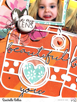
Hi friends! Today I am sharing another layout for CUT to YOU (created by Gwen) featuring the Camera Beautiful You cut file from the March 2018 release.
I wanted this layout to convey a whimsical yet simple feel featuring the camera cut file as a focal point without detracting from the silly photos.
I manipulated the cut file to add to the playful feel of the layout. To do this, I duplicated the camera shape three times (each the same size), rotated at different angles, randomly layered them on each other, and then welded into one shape prior to cutting.
I wanted to keep the cut file open but with some detail, so tracing the 'beautiful you' on each camera carefully with a black marker added a nice punch without being overdone. Adding some patterned paper and/or tracing paper was also good for a visual effect without being overpowering.
Adding a few fussy cut flowers, a bit of mist and some enamel dots finishes off this playful page and maintains the focus on these silly faces from my granddaughter.
Thanks for stopping by. Please do pop on over to the CUT to YOU HQ FB group, we love seeing what you create with Gwen’s beautiful creations!


Sooooooooo cute! LOVING those photos and the cameras!!!!!
ReplyDelete