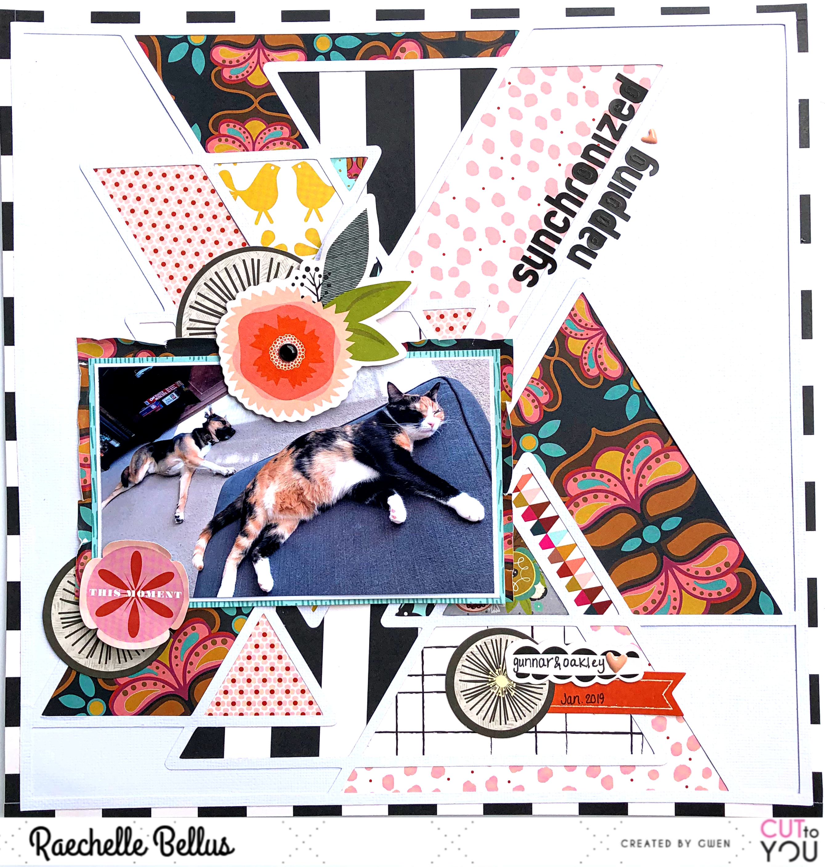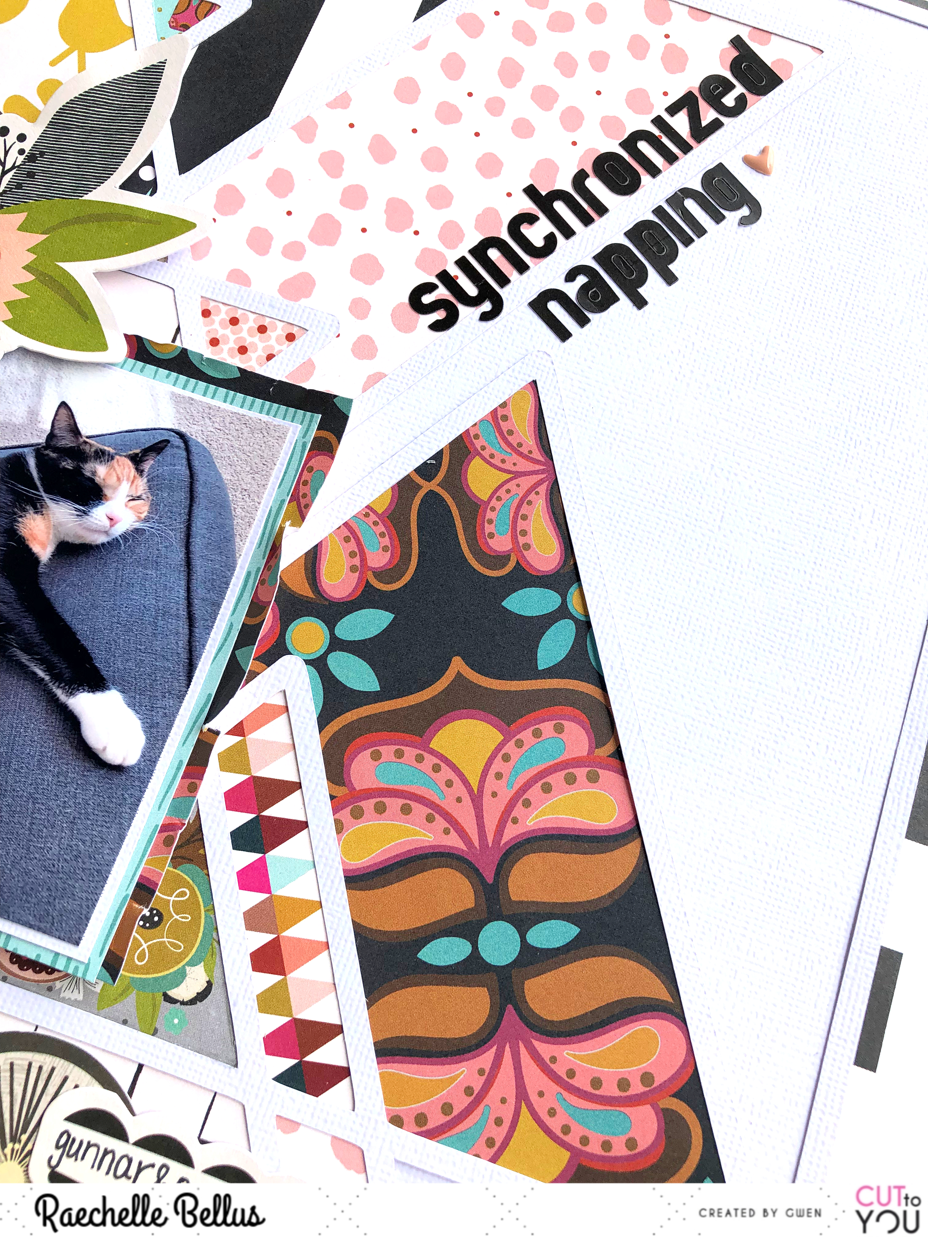
As I was filling in the background, I knew that I wanted it to be bold, yet not distracting from the sweet photo of my pets, so using some large prints as focal points along with mixing smaller prints with lighter colors was key.


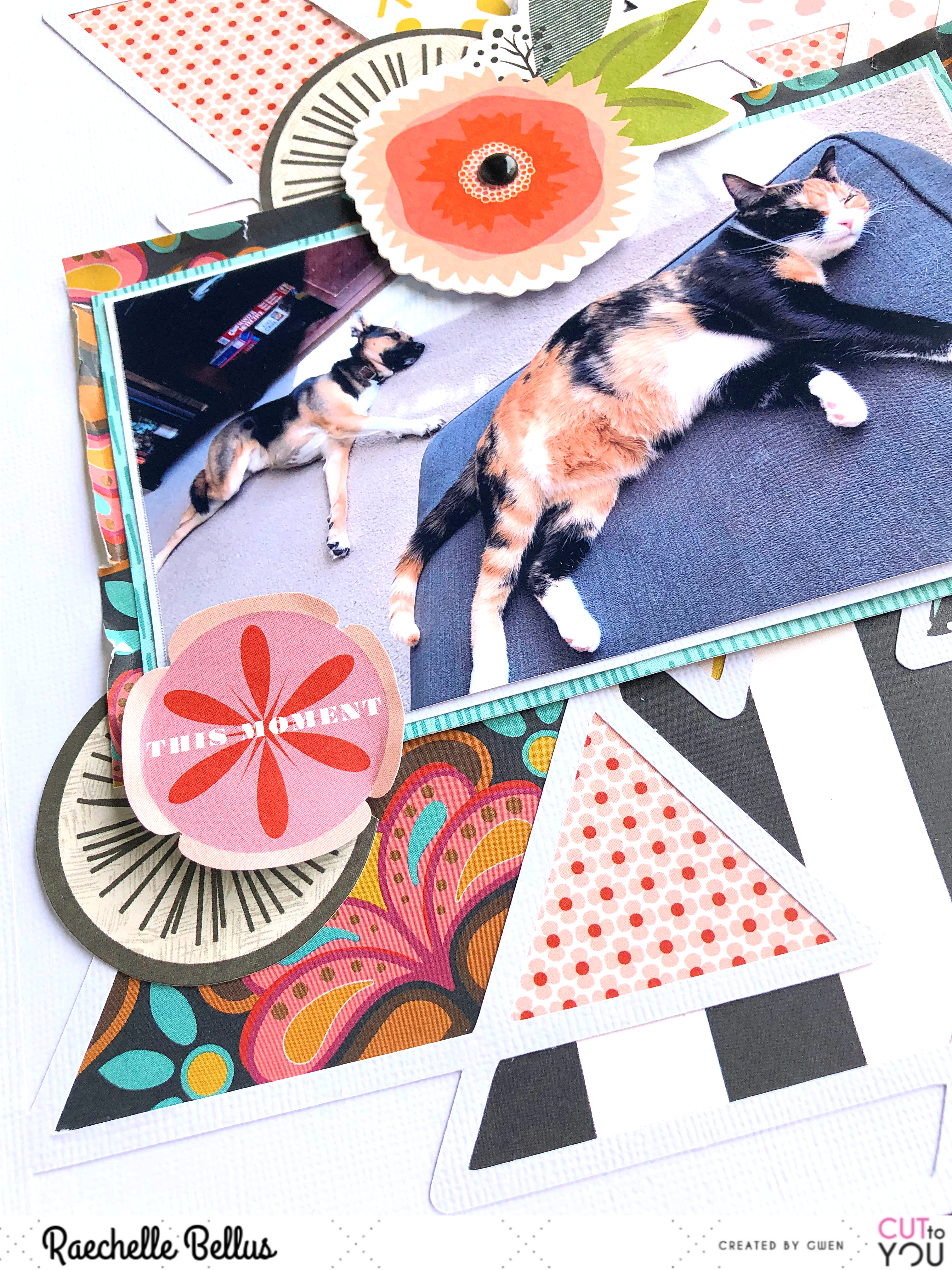
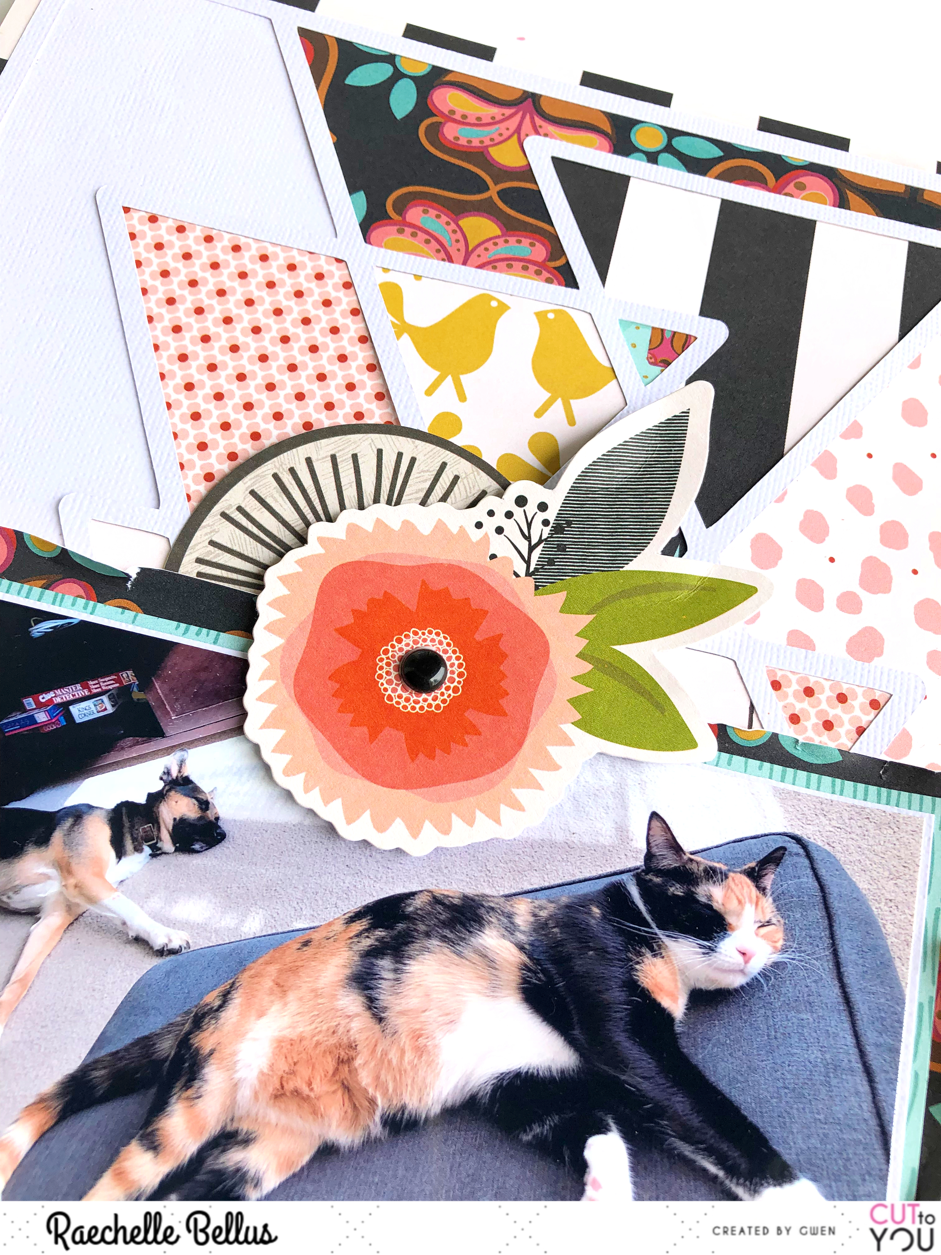
Finishing off with a trio of smple clusters keeps the eye moving and adds some visual interest.

I hope that you have been inspired by my layout to create! Head over to the store and start creating!
We love to see what you're making so don’t forget to share on the CUT to YOU HQ on facebook!
This is FABULOUS!!! I love the colors and the design!!!!
ReplyDelete